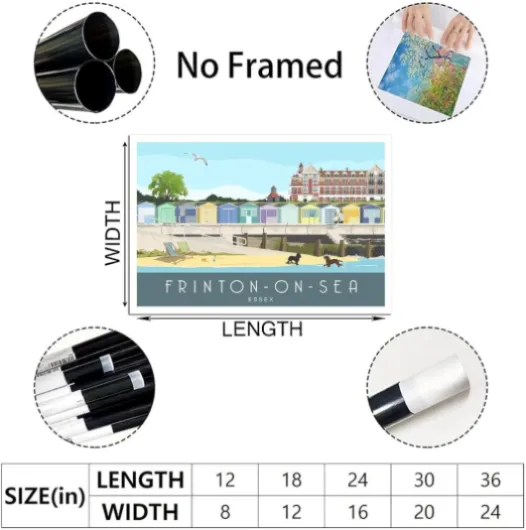
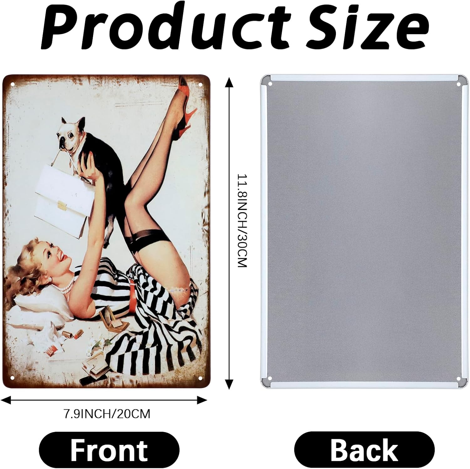
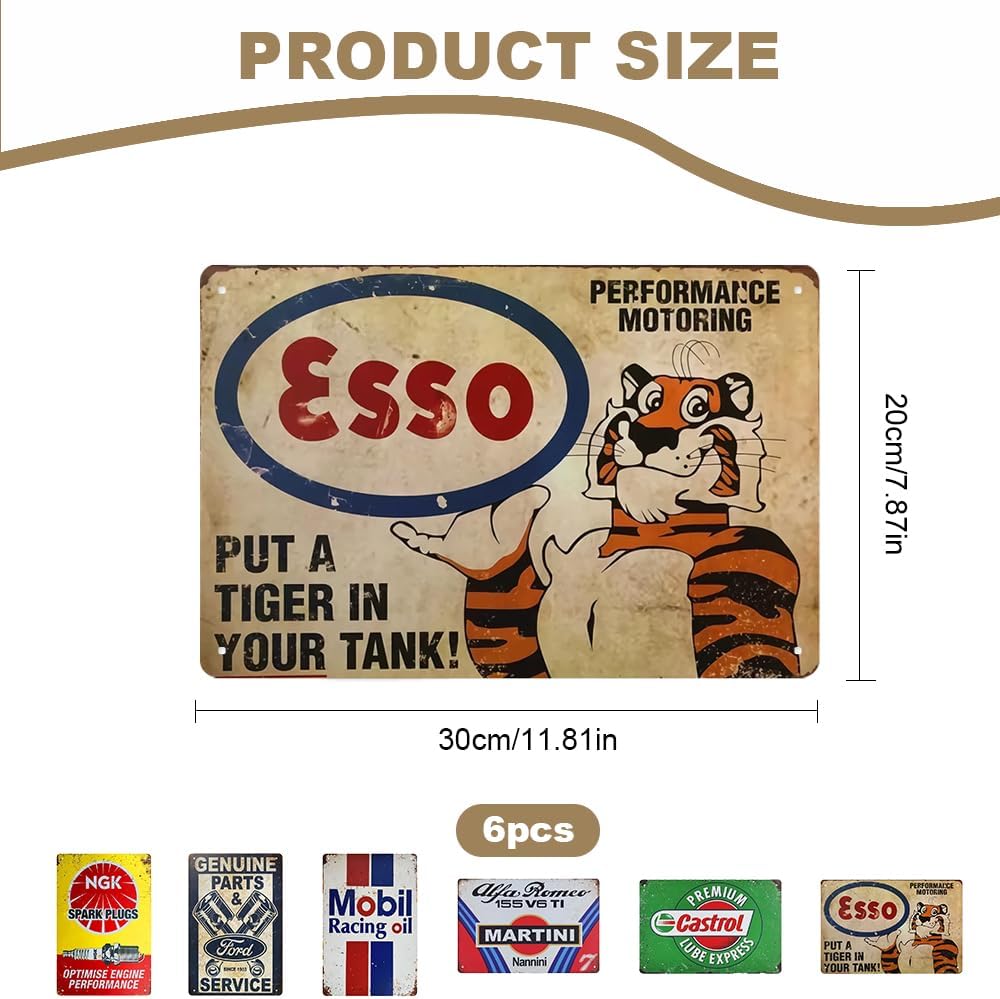
Choosing the right size from mini prints to giant wall art
Thinking about your wall, not just the artwork
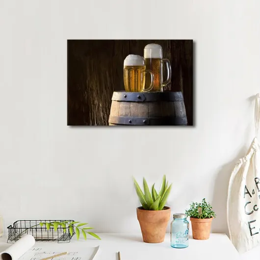
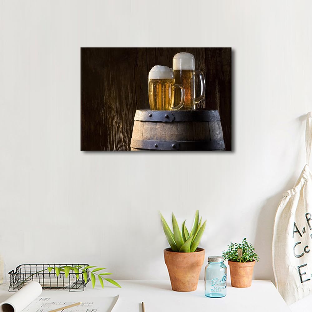
Before falling in love with a beer poster, take a moment to look at your wall. The size you choose should match both the room and the role you want the print to play. A single bold piece above a sofa or home bar can act as a focal point, while a cluster of smaller prints can echo the relaxed, social feel of a taproom.
Measure the space where your beer art will hang. As a rule of thumb, leave some breathing room around the edges so the poster does not feel cramped. Above furniture, aim for a width of around two-thirds the furniture length for a balanced look. This will also help you later when you decide between canvas, framed print or classic poster formats.
From mini prints to statement pieces
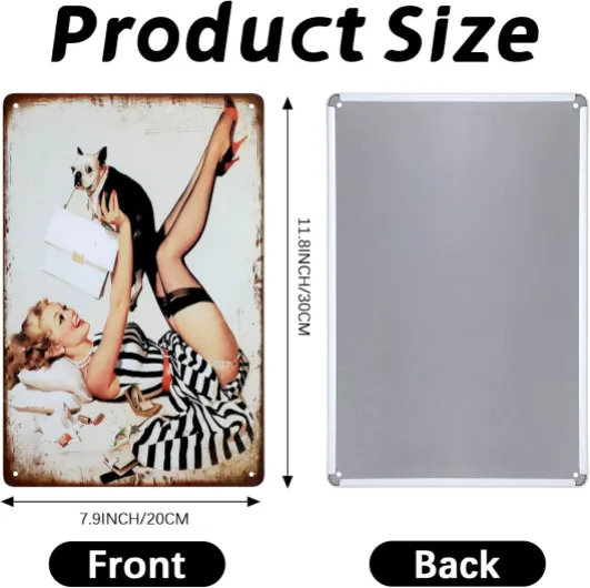
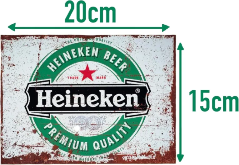
Smaller formats work well for tight spaces : corridors, kitchen corners, or that narrow wall next to your beer fridge. They are also perfect if you want to build a gallery wall mixing brewery logos, vintage labels and minimalist hop illustrations.
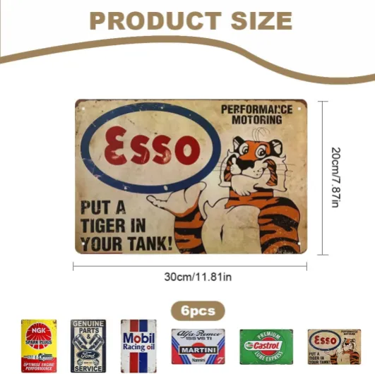
Medium sizes suit most living rooms and offices. They give enough visual impact to show off detailed artwork, yet remain easy to place and rearrange as your collection grows.
Oversized prints and giant wall art are ideal when you want your beer passion to be the star of the room. Think of them as the visual equivalent of a flagship brew : bold, memorable, and hard to ignore. If you like pairing posters with retro accessories, check out this selection of retro vintage beer items to build a cohesive theme around your statement piece.
Choosing the right size now will make it easier to focus on print quality, color and finish later, and to match your posters with the way you actually enjoy beer at home.
Understanding print quality, color and those strange fill and stroke words
What makes a beer print look sharp on your wall
When you fall in love with a beer poster online, you want it to look just as good in your bar corner or living room. That is where print quality steps in. A good rule of thumb : the higher the resolution, the crisper the details. Labels, foam, barley grains, even tiny typography should look clean, not fuzzy, when you stand close.
Color is just as important. Beer art often plays with warm ambers, deep browns and bright hops greens. If the print shop uses poor inks or cheap paper, those tones can turn dull or washed out. Look for terms like “archival inks” and “acid-free paper” ; they help colors stay vibrant for years, especially if your poster hangs near a window or in a bright kitchen.
Making sense of fill, stroke and other design jargon
When browsing beer posters, you may see words like “vector art”, “fill” and “stroke”. In simple terms, the fill is the color inside a shape (for example, the golden liquid in a pint), while the stroke is the outline around that shape. Strong, well balanced strokes keep icons and lettering readable from across the room, which matters if you are pairing your print with bold vintage beer signs or other statement pieces.
Vector files scale without losing sharpness, so they are ideal if you plan to go from a small print to a large wall piece later. This links back to choosing the right size and format : a high quality file with thoughtful fills and strokes will look great whether it is a modest A4 near your tap handles or a giant centerpiece above the sofa.
Canvas, framed print or poster : which format suits your beer space
Choosing between texture, depth and flexibility
When you start planning your beer wall, the first big decision is the format. Canvas, framed print and classic poster each bring a different vibe to your tasting corner, home bar or living room. Think of them as three ways to serve the same great beer label or hop illustration : same image, different glass.
Canvas prints for a warm, gallery feel
Canvas works brilliantly if you want your beer art to feel permanent and cozy. The textured surface softens sharp lines and gives vintage brewery logos or rustic pub scenes a painted look. Canvas is ideal above a sofa, in a dedicated beer cellar or in a space where you already have other wall art. Just remember : canvas is usually deeper on the wall, so check that it will not bump into shelves or glass racks.
Framed prints for structure and contrast
Framed prints suit beer fans who like a clean, curated style. A simple black or natural wood frame can turn a playful IPA illustration into a statement piece. Frames also protect the print from moisture and fingerprints, which is handy near a bar counter or in a busy kitchen. Match the frame color with your furniture, bottle racks or bar stools so the whole room feels intentional.
Posters for flexibility and playful layouts
Posters are perfect if you love to rotate your beer art with the seasons or new releases. They are lighter on the budget, easy to swap, and great for building a collage of tap lists, brewery maps and label art. Use quality poster hangers or slim frames to avoid the “student dorm” look, and combine different sizes you learned about earlier to keep the wall dynamic without feeling cluttered.
Where to find the best sellers and how to match posters with your beer life
Finding beer art that actually fits your world
Once you know the style, size and finish that suit your walls, the next step is tracking down pieces that feel authentic. Start with a mix of sources rather than relying on a single marketplace. That way you avoid ending up with the same mass‑produced print everyone else has in their bar corner.
- Specialized beer shops and breweries often sell limited posters tied to a specific brew, collab or event. These usually carry more story and personality than generic bar art.
- Online print platforms give you a huge range of sizes and paper types, which helps when you already know what works in your space from your earlier sizing and quality choices.
- Independent illustrators on portfolio sites or social media can customize colors, formats or even add your home bar name to a design.
Matching posters to your beer life
Think about how and where you enjoy beer, then let that guide your selection.
- Home bar or cellar : go for bold, high‑contrast prints that stand out in low light and echo your favorite styles, breweries or regions.
- Kitchen or dining area : softer palettes and food‑pairing themes work well, especially if you host tastings.
- Office or workspace : minimalist label art or vintage ads keep things subtle while still showing your passion.
Try building small themed clusters rather than scattering random pieces. For example, group three prints around one style (IPA, stout, lager) or one visual mood (vintage, minimalist, comic). Use what you learned about color, paper and framing to keep each cluster visually coherent, even if the artists and sources differ. That way your walls tell a clear beer story instead of feeling like a poster dump.